


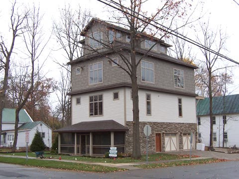
This monstrosity stirred up a lot of shock and consternation as it rose up on a middling-quality block on the north side of Saratoga Springs. The general complaint was that the building was "too tall," but this was actually the least of its errors. (See photo below.) The problems obtain not from its height but from poor proportioning and design. Basically, what you have here is a crab shack on top of a three story packing crate. Note that they have used a "heavier" (darker color) in the upper floors rather than the base. That makes the building look top-heavy." Notice that the volumes are simply stacked, like pallets in a frozen food warehouse. Notice the "change of materials" gambit on one side of the ground floor. It was supposed to give the base "weight" but it actually looks incongruous (and dumb). Notice the poor quality materials used for the screened-in porch, and especially the flimsy appearance of the columns. The windows are mere holes in the walls. There is absolutely no meaningful or graceful ornament. The neighbors are right about it being an ugly monstrosity, though, and that they will have to live with for the rest of their lives. Our knowledge and skill in building has been reduced almost to zero in this culture.
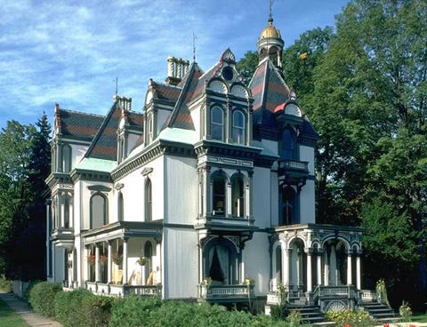
19th century four-story (inc. tower) house in the eclectic Second Empire style, Saratoga Springs, NY . Whatever else you might say about this exuberant building, notice that no one has ever complained about it being "too tall."